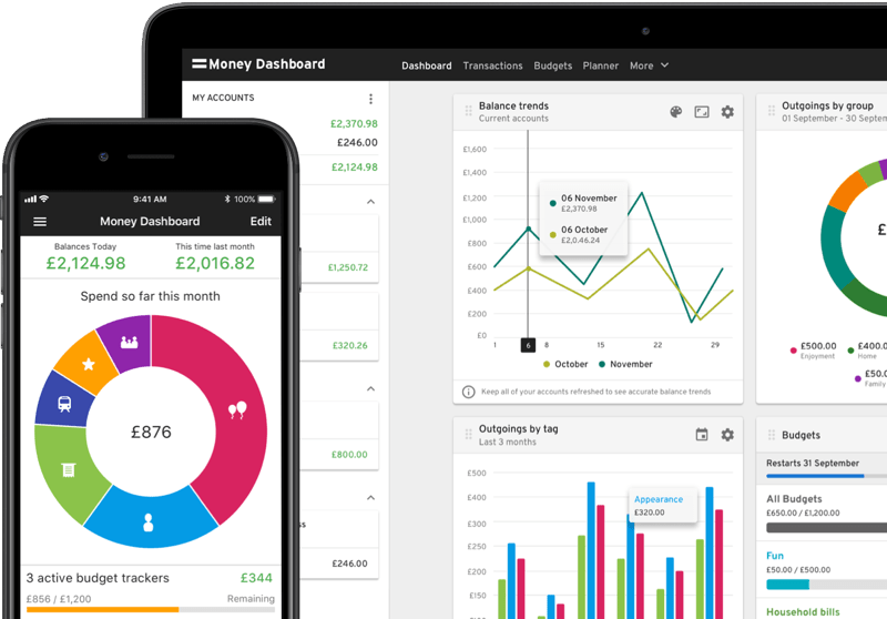
Not many businesses can say they are truly a pioneer in their space, particularly in the world of finance.
Fortunately for Money Dashboard, they can.
Why you might ask?
Money dashboard was one of, if not the first free online personal finance management service in the Uk.
But just because it’s one of the oldest money management tools, does it make it the best?
All of this and more will be analysed in this comprehensive Money Dashboard review.
What Is Money Dashboard?
As I alluded to in the introduction, Money Dashboard is a personal finance tool.
It was created by a small team in Edinborough all the way back in 2010.
It was originally designed for computers because guess what?
Apps weren’t even a thing when the company was founded.
But just like every successful company, you have to evolve and for Money Dashboard, this meant creating an app.
The app’s main mission was to further simplify a complex topic like finance.
Not only that but to give users a whole host of features and data, necessary to increase their money management skills.
It’s fair to say they have been largely successful in this endeavour as they have won ‘best money management app’ no less than 3 times.
The British Bank Awards gave them this title in 2017, 2018, 2020 and most recently in 2021.
The company would beat some of their toughest competitors such as Chip and Plum.
Despite this level of achievement, Money Dashboard released a statement on behalf of their team saying:
-“The team today is still motivated by the mission to help all Uk customers get more happy and successful by empowering them to take control of their finances”
How Does Moneydashboard Work?
Money Dashboard works via their app (desktop version still available) in which users who sign up, can connect all their bank accounts.
By connecting your accounts you can view them all in one place.
You can then analyse all your information to help you spend, save and borrow more efficiently.
Not to mention having many tools at your disposal such as categorisation, budgeting and your transaction history (more on this later).
Unfortunately, what Money Dashboard does not allow users to do is to move money between accounts.
The company is more focused on monitoring and money management rather than having traditional qualities that are more in line with a bank.
Competitors such as Yolt are making great advancements in this space in an attempt to become an all-in-one finance app.
Having said this, sometimes it doesn’t pay to do this because you can overcomplicate things and neglect older, more established features.
I’ve digressed, but these are all important things to consider when determining a business’s position in its market.
Moving on from this, we’re now going to take a look at how you can set up Money Dashboard.
Sign Up Process
(Note: If you have already signed up, skip this section of the Money Dashboard review)
Money dashboard is available on IOS, Android and desktop.
This walkthrough will be done via an IOS device.
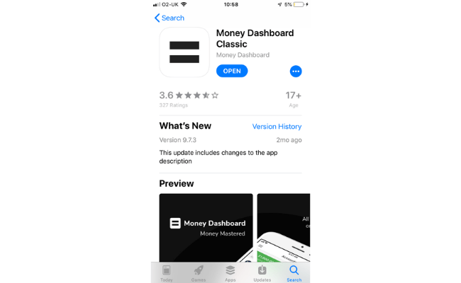
All you need to do is download Money Dashboard.
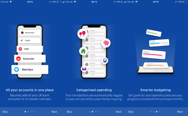
After it’s downloaded, click the icon and have a read of the highlight slides.
You’ll be asked to connect your various accounts via their list of eligible banks.
(Money Dashboard supports over 40 Uk banks and is constantly working to increase this number)

Once connected, you’ll be greeted with this message.
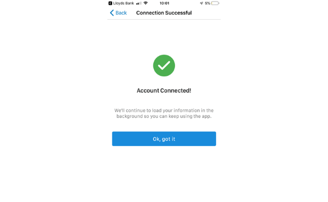
That’s all it takes to get set up with one bank account.
If you have multiple bank accounts, you can add each one individually quite simply.
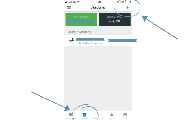
Just move over to the accounts section on the main interface and press the ‘+’ symbol.
Then repeat the process as seen in the initial sign upstage.
Money Dashboard Features
Perhaps the most interesting part of this Money Dashboard review is the features it provides.
In the competitive space that is money management apps, all companies are looking to surpass one another.
Having been in the game for over a decade, Money Dashboard has racked up a good amount of features.
Here’s a quick overview of each one individually and how you access/use each one to its full potential.
Categories
An important feature that Money Dashboard has had for a while now is being able to categorise your spending.
Money Dashboard says-
“If you are dealing with transaction data, good quality categorisation should be at the heart of your journey into the world of open banking”
They are absolutely right if you are going to manage your money, do everything properly and thoroughly.
Organisation can make all the difference.
Simply head over to ‘transactions’ and move over to ‘categories’ to categorise your transactions.
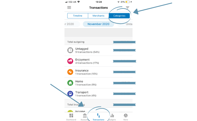
If you want to categorise all transactions classed as ‘untagged’, you can do so simply by clicking on each one.
From here you can place the correct tag.
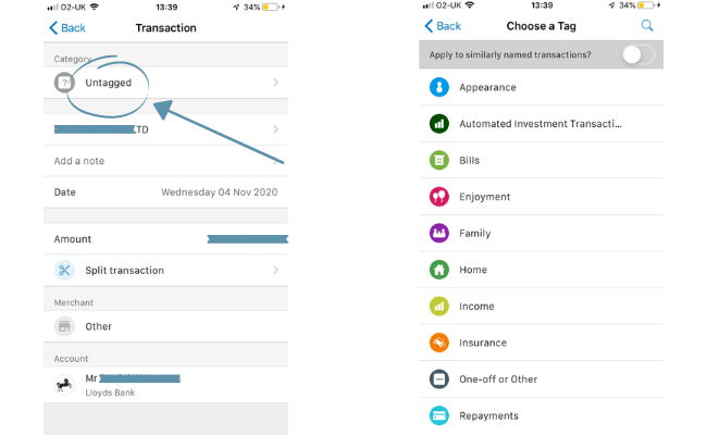
You may also see from the screenshot above (right side) that you can turn on a feature that applies the tag to similarly named transactions.
This could potentially save you a lot of time and effort!
Analytics
Money Dashboard values spending reports highly and can tell this by simply logging into the app.
You are greeted with, on the default page, a visual representation of your spending.
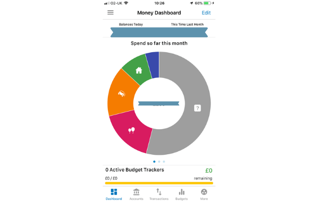
The accuracy and usefulness of this graph are accentuated when you categorise all of your transactions.
Other useful insights on the dashboard include:
- Comparison of your balance to this time last month (1)
- Your remaining budget left (2)
- How much you spent last month and on what (3)
Here is the location of the features listed above.
(1)
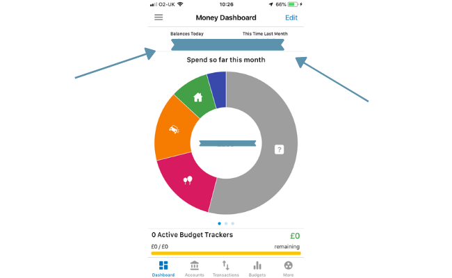
(2)
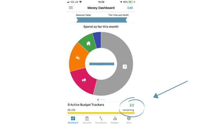 (3)
(3)
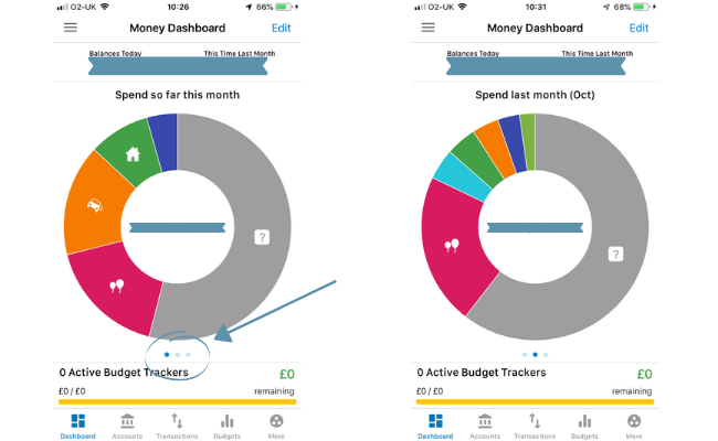
Transaction History
Money Dashboard has its own dedicated section to your transaction history.
You’ll find a list of your transactions which can go back as far as December 2007.
To access this feature just move along to the transactions section located at the bottom of your screen.
Budgets
Money dashboard has a feature in which its users can set budgets.
This is a great tool to use and is normally exclusive to app-only banks such as Monese and Monzo.
By setting a budget, it will serve as a friendly reminder not to go over your limit and plan around it instead.
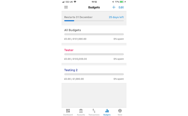
To set a budget, head over to the ‘budget’ section and click ‘+’.

From here you can personalise your budget, including its name, the amount, the tag and the colour.
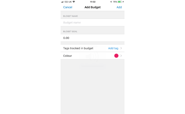
Once you confirm it, your budget will now appear in that section as well as at the bottom of the main dashboard.
Spend Reports
Your spend reports are essentially a deep dive into where all you money is going.
Money Dashboard produces a series of slides that looks at different aspects of expenditures clearly and visually.
To access your spend reports, move over to ‘more’ and press ‘spend reports’.
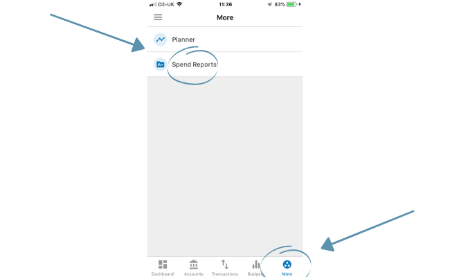
You’ll first look at your ins and outgoings compared side by side.
Then your categorised spending.
Lastly, Money Dashboard reveals how much you’ve spent with your top 10 merchants and along with the frequency.
Is Money Dashboard Safe?
Money Dashboard is regulated by the FCA or Financial Conduct Authority.
The goals of the FCA are to:
- To safeguard customers
- Enhance the integrity of the Uk financial system
- To promote healthy competition
Money Dashboard proudly advertises that they uphold a level of security on par with high street banks.
They state:
“Our services are routinely inspected, tested and audited by qualified security and data specialists”
The company also likes to make users aware that over the course of their 10 years in business, they have securely imported over 600 million transactions.
By utilising open banking, Money Dashboard can access your financial details but ultimately gives you more control over your data.
Cost Of Money Dashboard
Money Dashboard is 100% free to download and use on all versions.
If that’s the case then how do they pay their staff and have the capital to keep rolling out new features?
The answer is that Money Dashboard provides insight and market research services to other companies via its user’s account.
So they essentially sell your data.
Although that may sound negative, it should be made clear that strict and robust procedures are in place.
This includes fully anonymising the banking data on the platform and never using the user’s personal details for their market research products.
Money Dashboard states that in the future they might give user’s suggestions for financial products such as credit cards, mortgages etc.
That would mean that they may earn a commission from the product provider too.
Money Dashboard Neon
This Money Dashboard review was done on their ‘classic’ product, however, it’s worth mentioning a bit about ‘Neon’.
It’s essentially the Money Dashboard that prior users know and love but built on an updated technological foundation.
In theory, it’s much faster in terms of performance and in rolling out new features, courtesy of its new back-end services.
I decided to review the classic version, simply because it’s the more established product of the two and is more widely reviewed by users.
I’ll be sure to revisit the neon app at some point in the future and consider whether or not it’s changed enough from the classic to do a separate review.
Money Dashboard Reviews
Money Dashboard is rated 3.6 out of 5 on Trustpilot, which is classed as average overall.
What’s confusing is that the reviews are a mixture of both products.
This page is likely a review of the classic edition because it doesn’t specify that it’s the Neon version in the title.
You’d think they create a separate page but we’ll work with what we have.
The Money Dashboard reviews collectively produce these sorts of comments:
- ‘Used for years, now looking for an alternative’
- ‘Loved this software for a couple of years, now it’s no longer a viable product’
- ‘Used to be so good’
But it’s not all doom and gloom, some Money Dashboard reviews, particularly the older one, have been positive:
- ‘Useful tool for monitoring expenses’
- ‘All your accounts under one roof and for free’
- ‘Has genuinely helped me manage my finances better’
FAQS
Is Moneydashboard Free?
Yes, Moneydashboard is free to use.
Is The Moneydashbaord App Safe?
The Moneydashboard app has various security measures in place to ensure your personal details are safe.
Can I Pay Bills With Moneydashboard?
No, Moneydashboard purely helps you manage and analyse your finances- it’s not the same as a bank.
Conclusion On This Money Dashboard Review
Drawing this Money Dashboard review to a close, it seems that the response to the app is mixed.
The advantage still does seems to lie with the classic edition but it’s got its issues.
For me, the interface is dull, uninspiring and dated.
Companies such as Yolt and Plum are pushing to be more modern, visual approach to money management.
I think this was a revelation that Money Dashboard had because the Neon version does look better aesthetically.
But again, the majority seem to side with the classic edition.
Judging by the response to Neon, at least at the time of writing, it’s been lacklustre; many users suggesting it’s a step back, not forward.
Perhaps by trying to do what every other good company does, which is to evolve, they have lost sight of what made the initial product good.
This, coupled with innovative and successful competition leads me to say that there are better options out there than Money Dashboard.
That doesn’t mean to say I don’t like either version because I do and so does the British Bank Awards.
I just think the quality of the competition in this space has left them behind.
Related articles:
Be sure to leave a comment if you enjoyed this Money Dashboard review and check The Money Equation out on social media!
